
You are using an out of date browser. It may not display this or other websites correctly.
You should upgrade or use an alternative browser.
You should upgrade or use an alternative browser.
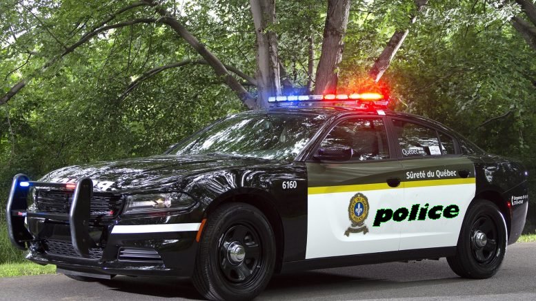
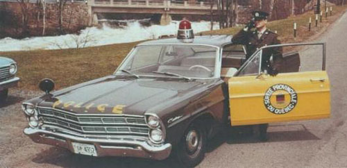
News: New SQ Paintjob
- Thread starter DannyITR
- Start date
Juslav
Legacy Member

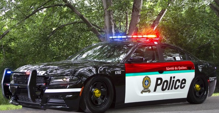
le vert et jaune est ideux.
fait juste le faire finir en pointe avant la fin de la porte et ca va deja etre 100x moins pire.
la ligne jaune pourrais suivre le design du char et au moins s'enligne avec les 2 poignée et le vert finir pointu sur la ligne jaune et non pas carré avec la porte et unu dernière section blanche pour se rendre a la vitre.
batard chu nul en design mais j'ai pas 2 ans non plus.
Anyways c'est tout printer sur un wrap...il peuvent faire le design qu'ils veulent et ca coute pas plus cher.
paradigmqc
Premium

HeavyMetal
New member
Au moins, ça va matcher leur nouveau suit.
Letter to SQ: Emulate Europe, not the US
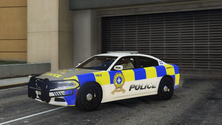
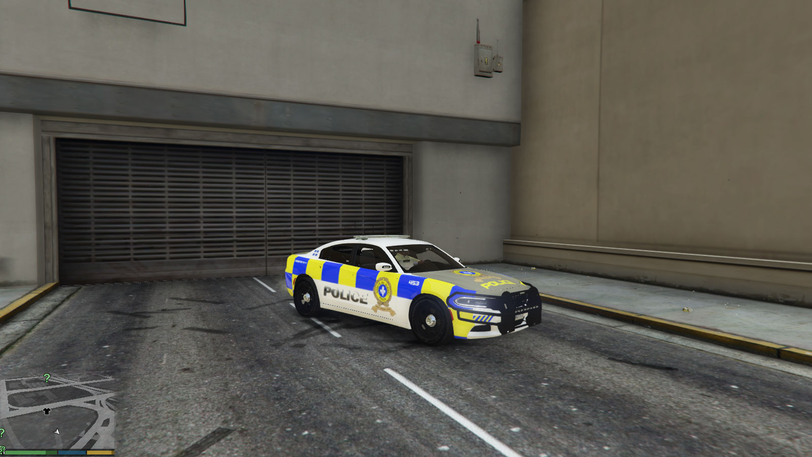
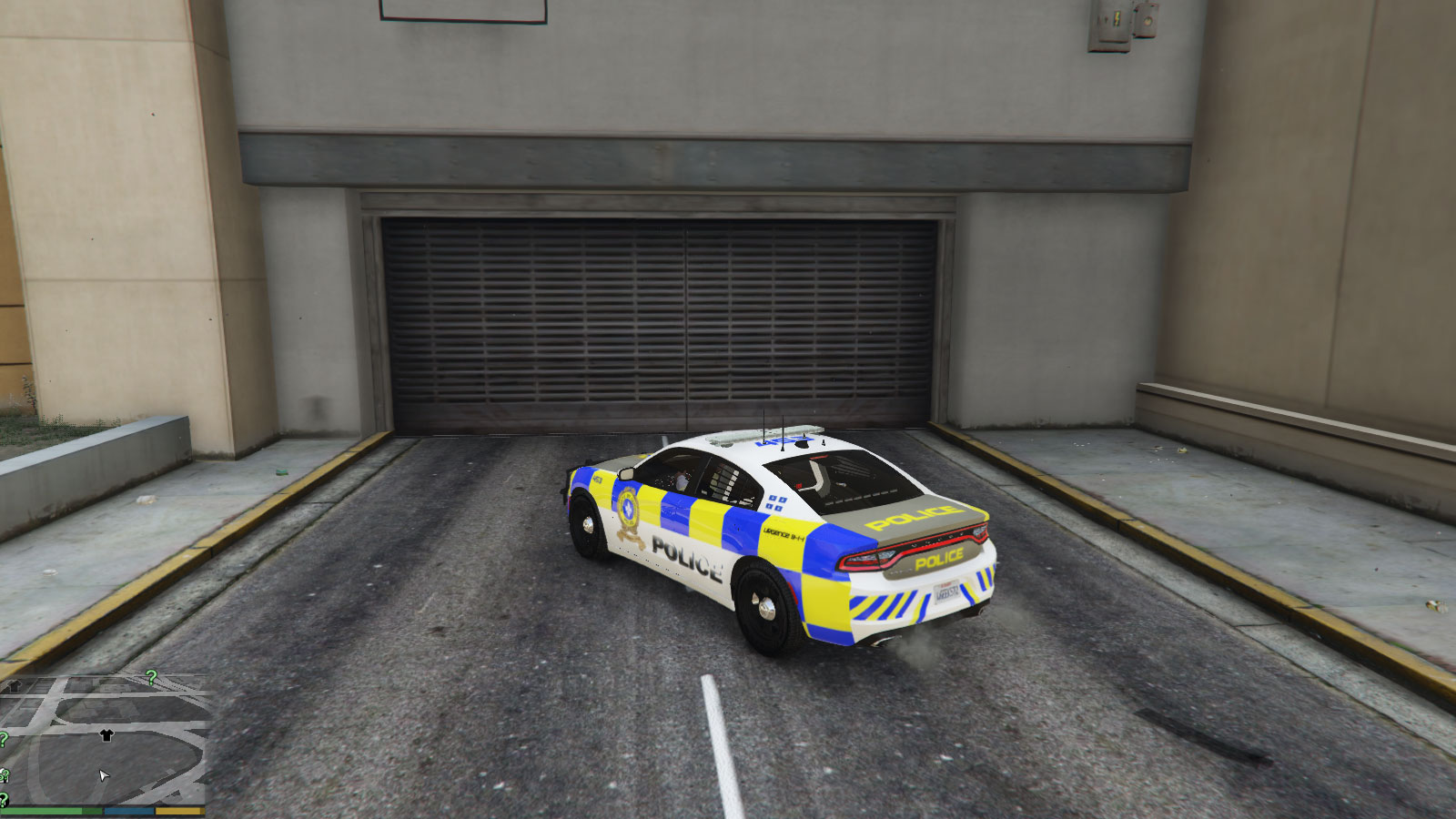
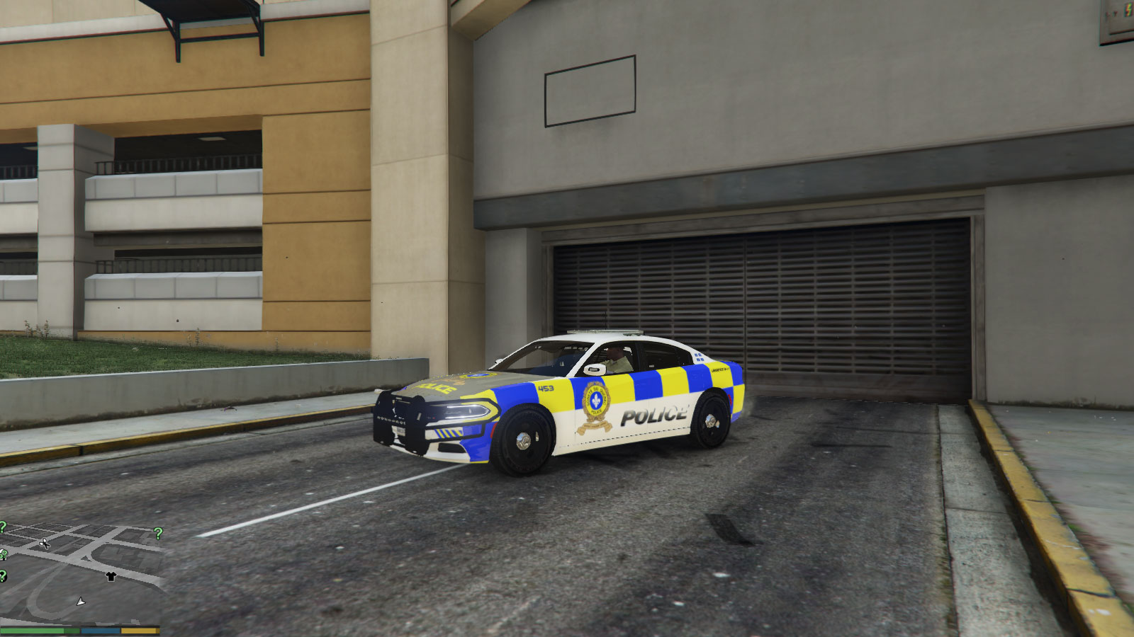
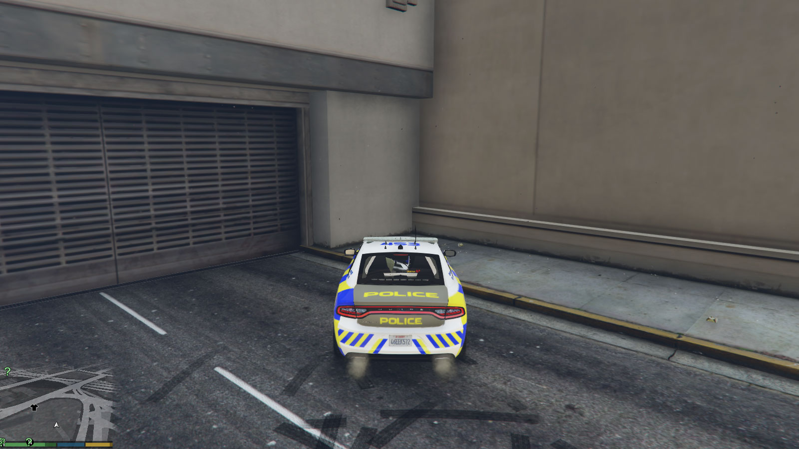
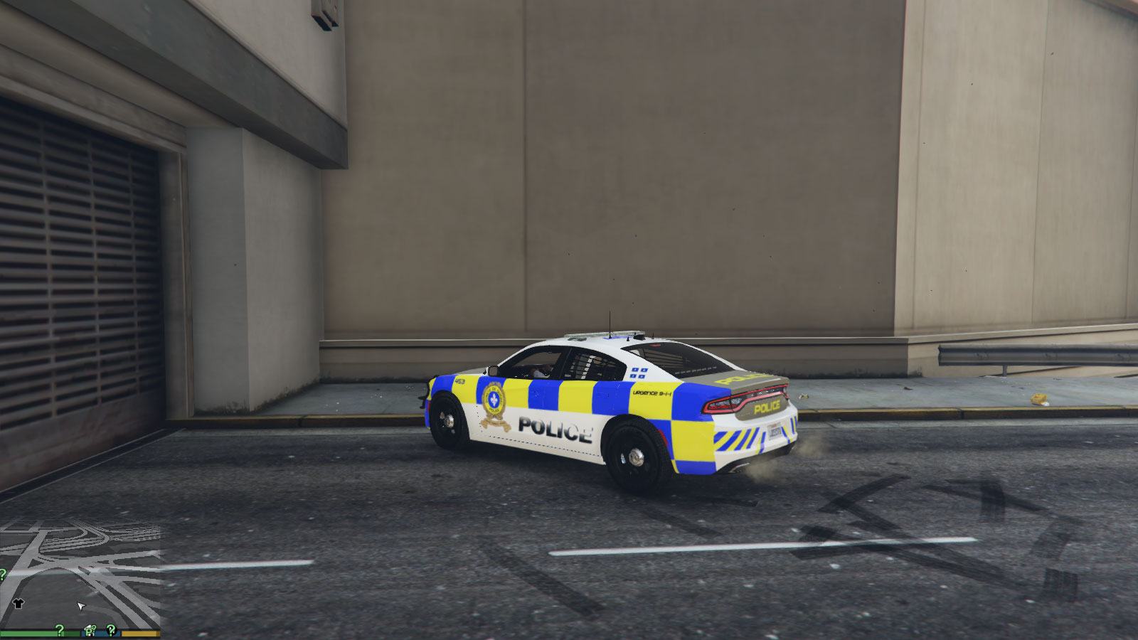
What do you guys think of my letter and new color scheme?
First of all I would like to thank you for your service to this province and its citizens. The Sûreté Du Québec is an indispensable part of our beautiful society and the public owes all of its members a debt of gratitude.
I was disappointed after seeing the new color scheme released yesterday. I don’t feel that it’s up to the standards of your organization and I urge you to stop its implementation in favor of a better conceived, friendlier design.
The black and white theme unveiled yesterday gives the impression that the SQ would like to emulate one of many departments in the USA. At a time when American police are become more militarized with a growing number of unnecessarily violent encounters, we should look not to them for inspiration but to our European friends instead.
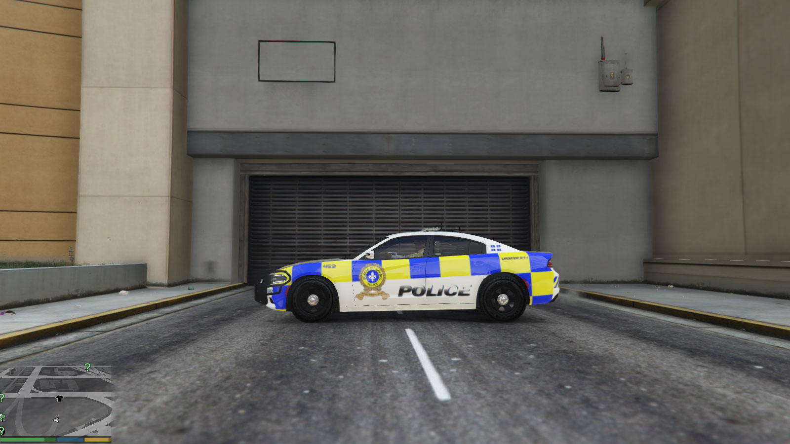
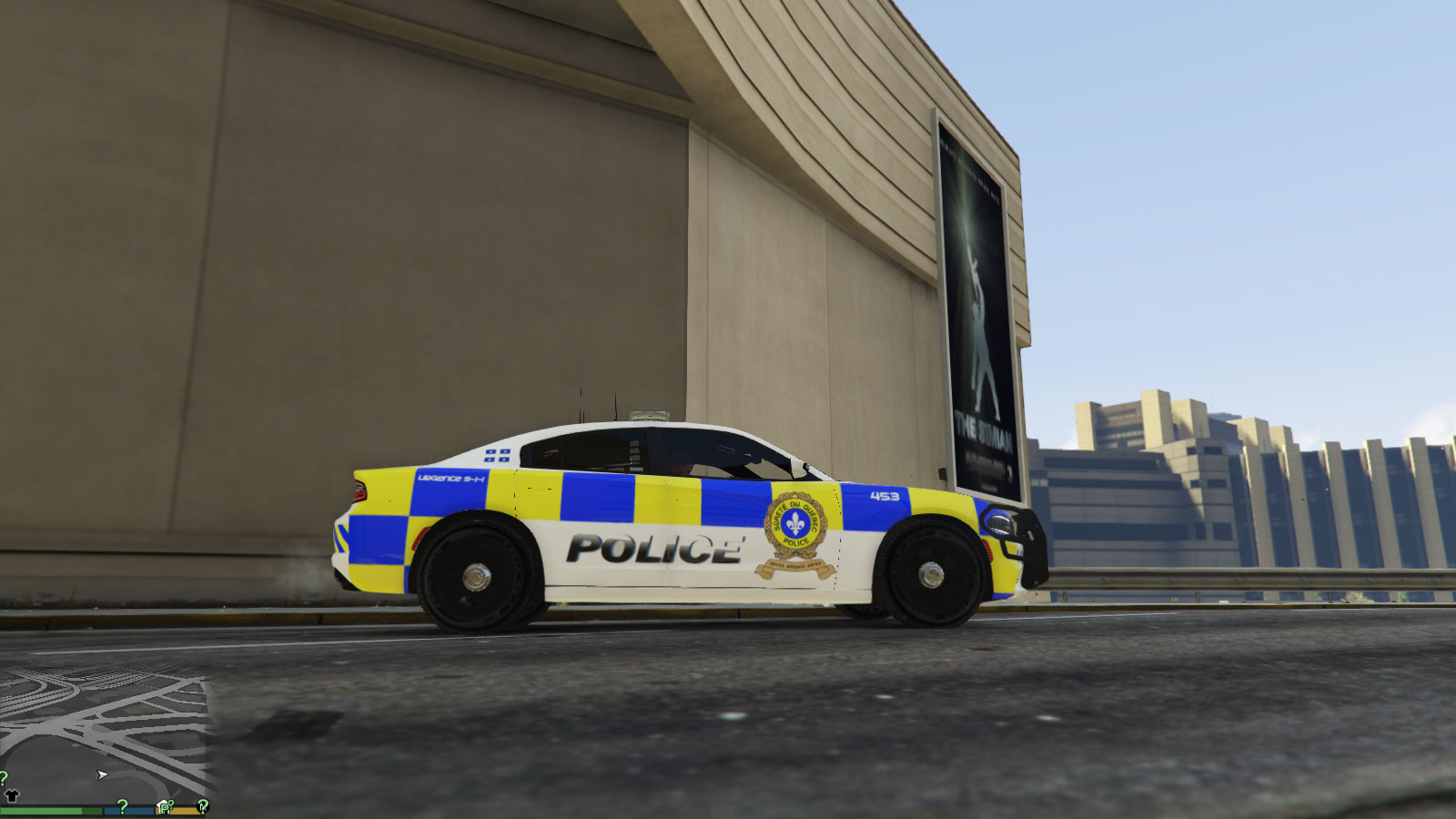
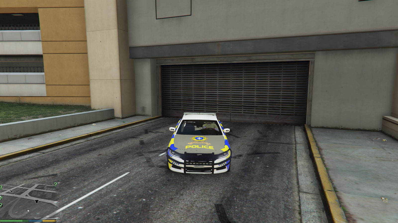
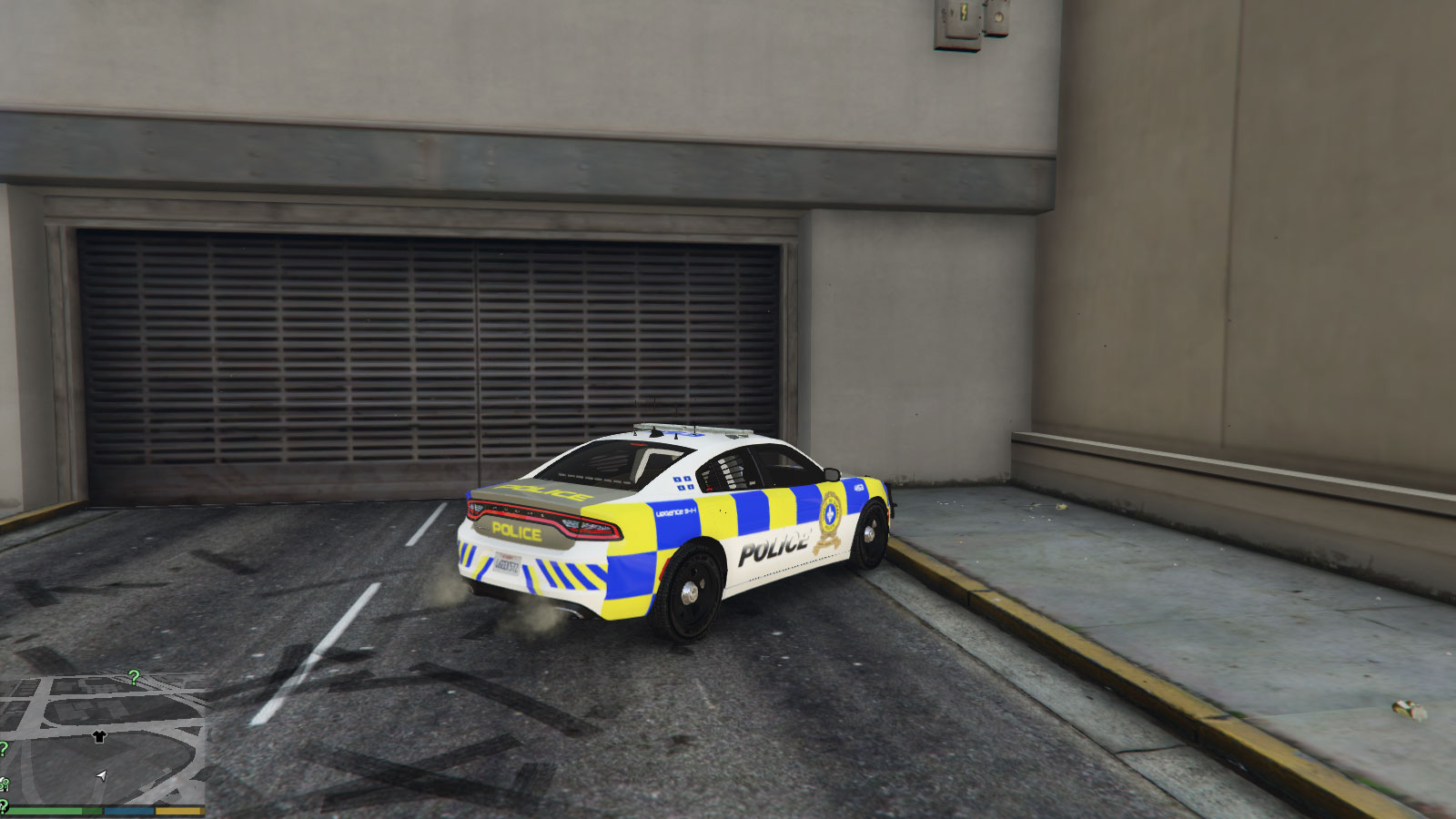
The European look is designed to be warm, friendly, visible and welcoming which is in line with what I’d like my police force to be. I have taken the liberty to create a few renders of what I think the SQ vehicles should look like. I’ve used only colors that are currently part of the SQ logo and made sure to keep the green which is historically been part of the SQ look.
I hope you like it.
What do you guys think of my letter and new color scheme?
First of all I would like to thank you for your service to this province and its citizens. The Sûreté Du Québec is an indispensable part of our beautiful society and the public owes all of its members a debt of gratitude.
I was disappointed after seeing the new color scheme released yesterday. I don’t feel that it’s up to the standards of your organization and I urge you to stop its implementation in favor of a better conceived, friendlier design.
The black and white theme unveiled yesterday gives the impression that the SQ would like to emulate one of many departments in the USA. At a time when American police are become more militarized with a growing number of unnecessarily violent encounters, we should look not to them for inspiration but to our European friends instead.
The European look is designed to be warm, friendly, visible and welcoming which is in line with what I’d like my police force to be. I have taken the liberty to create a few renders of what I think the SQ vehicles should look like. I’ve used only colors that are currently part of the SQ logo and made sure to keep the green which is historically been part of the SQ look.
I hope you like it.
Z33 even
New member
Letter to SQ: Emulate Europe, not the US
https://www.montrealracing.com/wp/wp-content/uploads/2017/07/SQscreen03b-777x437.jpg
What do you guys think of my letter and new color scheme?
First of all I would like to thank you for your service to this province and its citizens. The Sûreté Du Québec is an indispensable part of our beautiful society and the public owes all of its members a debt of gratitude.
I was disappointed after seeing the new color scheme released yesterday. I don’t feel that it’s up to the standards of your organization and I urge you to stop its implementation in favor of a better conceived, friendlier design.
The black and white theme unveiled yesterday gives the impression that the SQ would like to emulate one of many departments in the USA. At a time when American police are become more militarized with a growing number of unnecessarily violent encounters, we should look not to them for inspiration but to our European friends instead.
The European look is designed to be warm, friendly, visible and welcoming which is in line with what I’d like my police force to be. I have taken the liberty to create a few renders of what I think the SQ vehicles should look like. I’ve used only colors that are currently part of the SQ logo and made sure to keep the green which is historically been part of the SQ look.
Cette phrase va les turn off
Letter to SQ: Emulate Europe, not the US
https://www.montrealracing.com/wp/wp-content/uploads/2017/07/SQscreen03b-777x437.jpg
What do you guys think of my letter and new color scheme?
First of all I would like to thank you for your service to this province and its citizens. The Sûreté Du Québec is an indispensable part of our beautiful society and the public owes all of its members a debt of gratitude.
I was disappointed after seeing the new color scheme released yesterday. I don’t feel that it’s up to the standards of your organization and I urge you to stop its implementation in favor of a better conceived, friendlier design.
The black and white theme unveiled yesterday gives the impression that the SQ would like to emulate one of many departments in the USA. At a time when American police are become more militarized with a growing number of unnecessarily violent encounters, we should look not to them for inspiration but to our European friends instead.
The European look is designed to be warm, friendly, visible and welcoming which is in line with what I’d like my police force to be. I have taken the liberty to create a few renders of what I think the SQ vehicles should look like. I’ve used only colors that are currently part of the SQ logo and made sure to keep the green which is historically been part of the SQ look.
I hope you like it.
https://www.montrealracing.com/wp/wp-content/uploads/2017/07/SQscreen01.jpg
https://www.montrealracing.com/wp/wp-content/uploads/2017/07/SQscreen02.jpg https://www.montrealracing.com/wp/wp-content/uploads/2017/07/SQscreen03.jpg https://www.montrealracing.com/wp/wp-content/uploads/2017/07/SQscreen04.jpg https://www.montrealracing.com/wp/wp-content/uploads/2017/07/SQscreen05.jpg https://www.montrealracing.com/wp/wp-content/uploads/2017/07/SQscreen06.jpg https://www.montrealracing.com/wp/wp-content/uploads/2017/07/SQscreen07.jpg https://www.montrealracing.com/wp/wp-content/uploads/2017/07/SQscreen08.jpg https://www.montrealracing.com/wp/wp-content/uploads/2017/07/SQscreen09.jpg
J'espère honnêtement que tu n'as pas envoyé une lettre officielle à Martin Prud'homme avec des photos d'une qualité graphique de GTA 3? Ou juste envoyer un exemple de voiture de police de rêve au boss de la SQ en prenant le jeu GTA comme exemple... eh boy
En plus on dirait que c'est CJ au volant
